Negative space? What’d that? It doesn’t sound very nice!
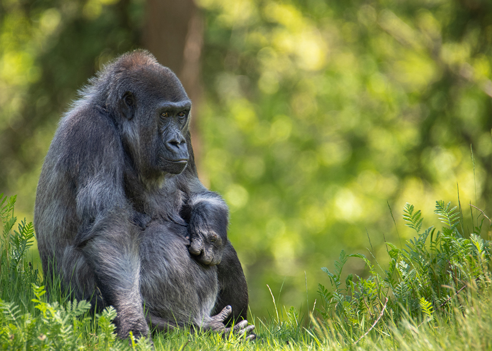
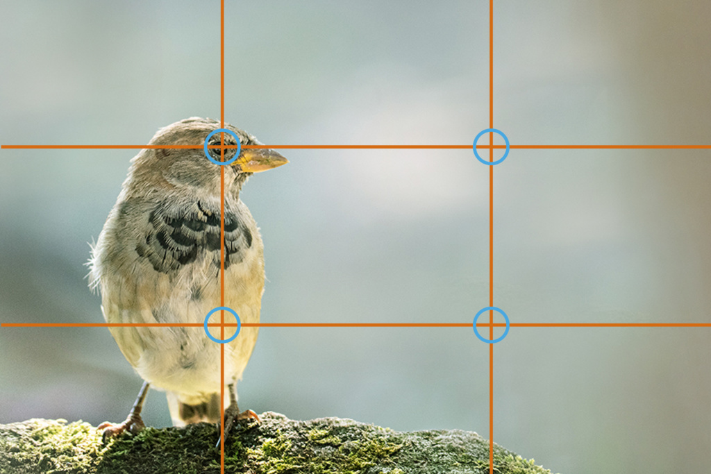
It’s not too bad. It’s a composition option in photography. All photos I share have negative space. Part of the image is “blank”. This way you can draw more attention to the subject. There are even more composition rules that apply to these photos. The rule of thirds is one of them. Where you put the subject or the most important part of the subject on an imaginary line in your photo. A line that divides the photo into thirds. Or even better, at the intersection of two of those lines. There are many rules that can help make a photo more interesting. Those rules are not mandatory of course. It is based more on what we humans find attractive, how our eyes work, etc. You don’t have to comply by them, but you can. A nice short video on the subject is this one: Link What can make a photo even more exciting is by doing the exact opposite, but in a beautiful way.
As mentioned, photos with negative space. Under each photo I write where and when they were taken.


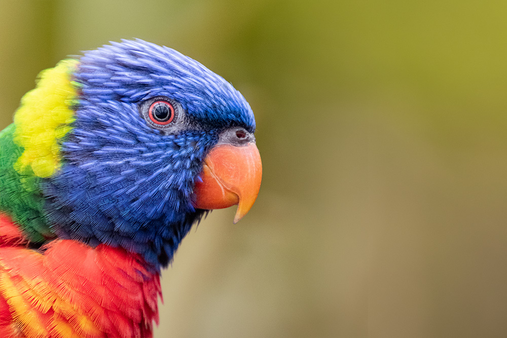


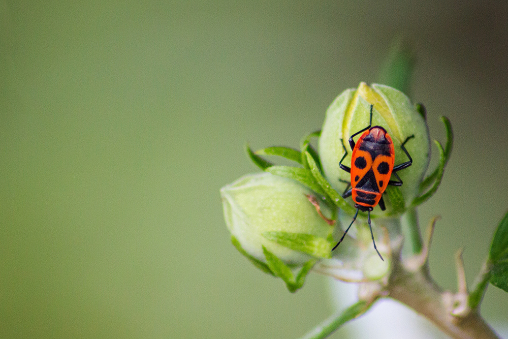

The other half of the photo does not have to be empty for the “negative space effect”. However, it should be less expressive.
