Sharing a post with a lot of photos. Edits of photos I made in 2019. I’m sharing this many to show how I get to one or two very special ones.
On December 17 I received the Adobe Creative Magazine in the mail. It’s always full of ideas and often has freebies too. This time there was an action pack you could download. The Christmas break meant that I had time to play. What I’m sharing here are the first test, oh and I made more, but many of them looked to horrible to share here.
If you want to play too, you can download the action here en read about how it is done.
I started out with some jpg-files I had edited and shared recently.
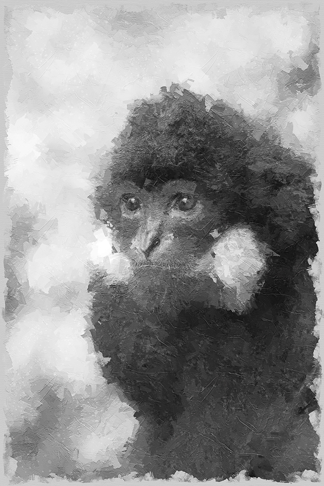
This was a monochrome photo of Mike. So I started with a monochrome image and did not use the option to convert the image after using the action.
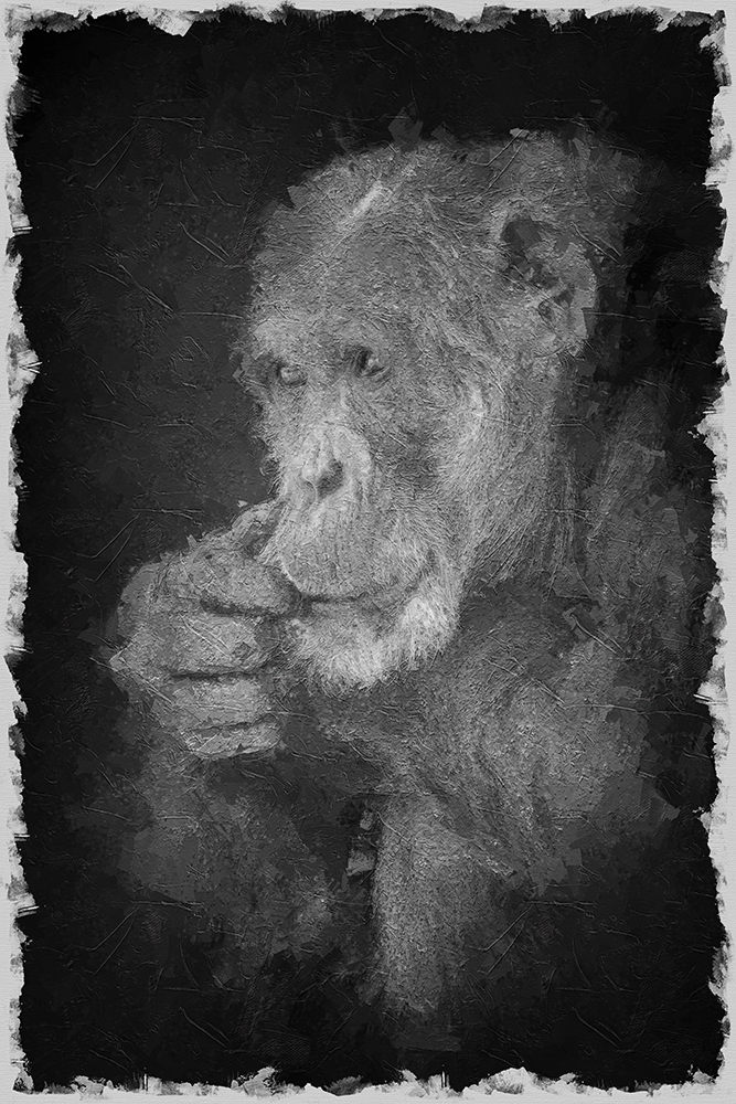
Next step was this image of a tiger I took in Natur Zoo Rheine.
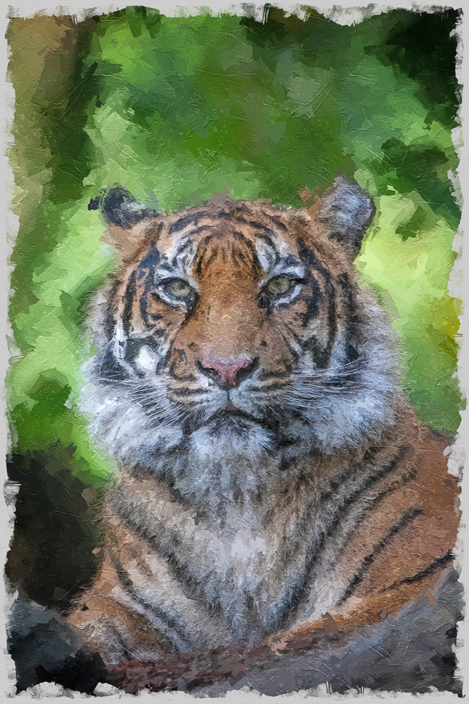
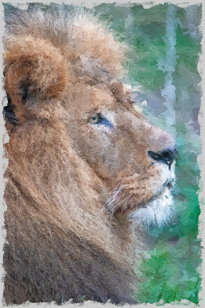
Next I tried some photos I made last week in Dierenpark Amersfoort and Burgers Zoo.
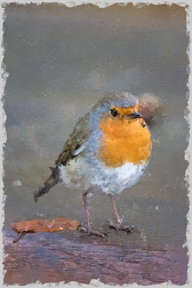
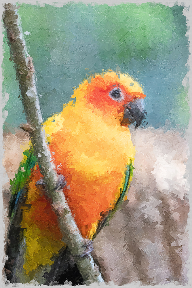
Again a photo I converted to monochrome before using the action. I used Silver Efex Pro for the conversion.
I did the conversion first, because I noticed that the result of the action looks best if there is a clear contrast between the subject and the background.
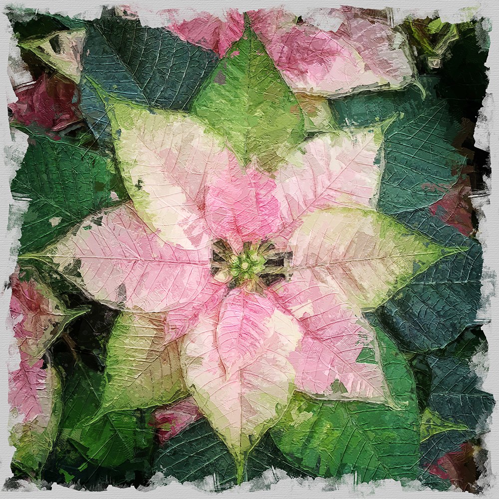
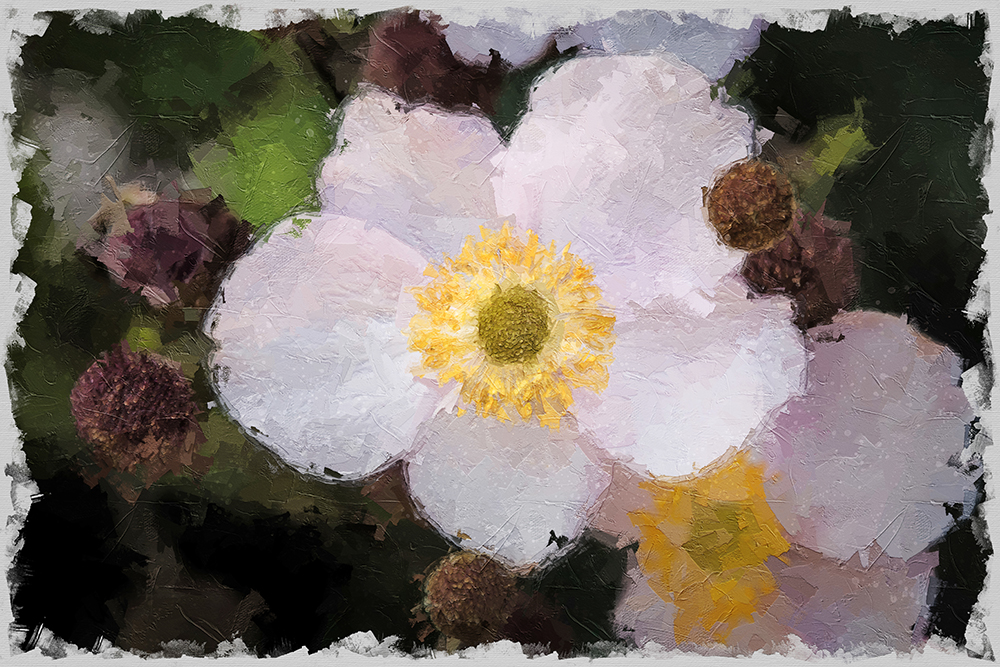
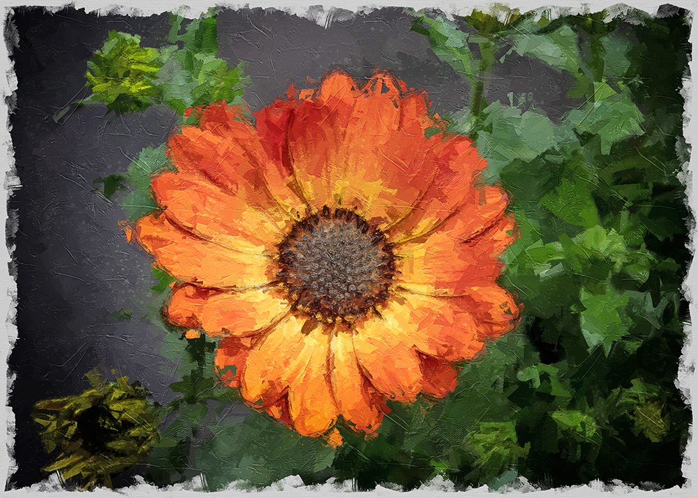
And of course I had to try it with flowers. Here too, the best results were with a lot of contrast between the flower and the background. Without it, the flowers become too vague.
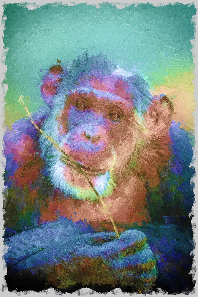
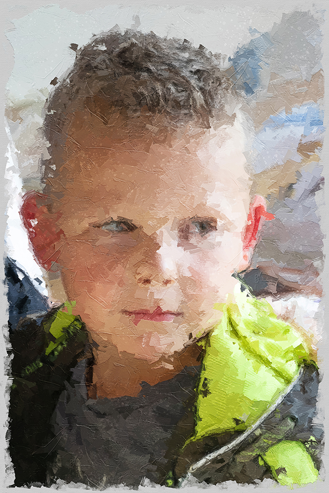
Next step, more color. I used this photo of Mike and gave him a graduate colorful overlay. I’m not sure about this result, but it is something that can be tested some more.
Next I turned to my VIP’s. Here two very important persons 🙂 Baby Jackson and his brother Djarro.
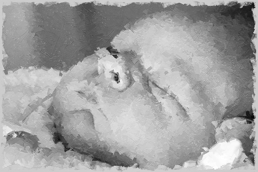
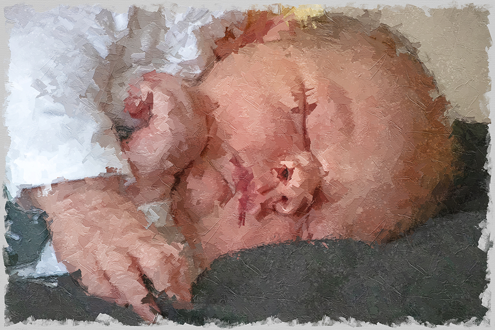
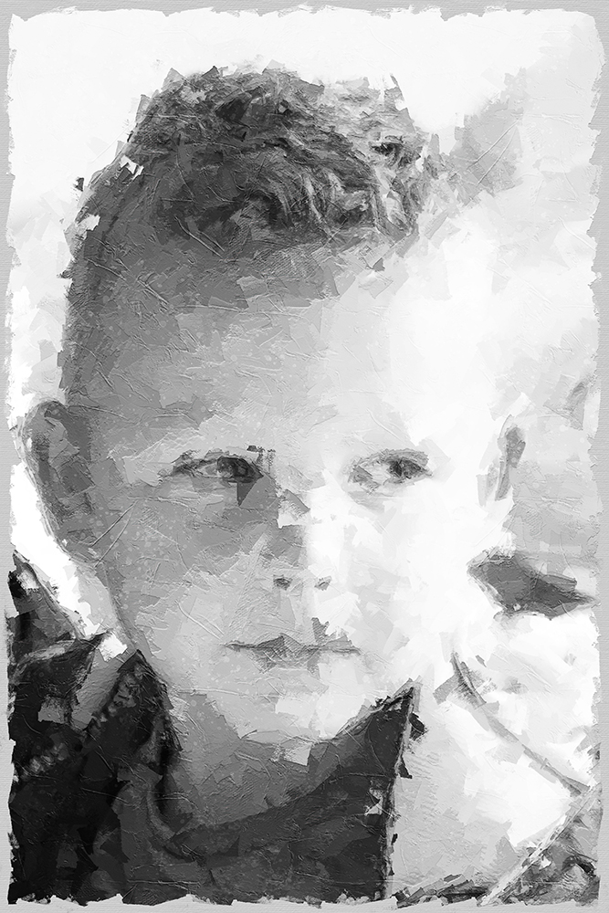
This is the same photo, different crops. I like the light monochrome better. Darker monochrome versions look gray and boring in my opinion.
The very light monochrome loses detail, but in case of these small children that fits perfectly.
One more week of Christmas break, so I have a lot more playtime 🙂
